Can anyone tell me what this pattern is?
By
Caemgen,
Posted on: 2009-11-27 01:21 in Multi-Media Fan Creations
I would say it's less of a "pattern" which is not always repeated this much, but more of a border. Try image searching for "Celtic Borders", then it's just a matter of how large you want the border to be, and how often it will repeat in any direction. Good luck, would love to see the finish... Are you drawing this in Flash? Because you could import a pattern brush from Illustrator into Flash, and make it easier on yourself.
Quote:
Well, at least I know what it looks like now, but HOLY HELL will that be tedious to do! I'll probably use some combination of this for the straight lines and this for the corners. But all of that stuff looks like it's embossed, which means I'll be drawing little highlights and shadows on ever frikkin' ridge and groove and that'll just frustrate me out of my MIND! But, you know, anything that's worth doing is worth doing well, and I'm doing it for myself, so I might as well go the extra mile. The little touches really make all the difference.|
Originally Posted by LadyJudgement

I would say it's less of a "pattern" which is not always repeated this much, but more of a border. Try image searching for "Celtic Borders", then it's just a matter of how large you want the border to be, and how often it will repeat in any direction. Good luck, would love to see the finish... Are you drawing this in Flash? Because you could import a pattern brush from Illustrator into Flash, and make it easier on yourself.
|
And, yes, I'm drawing it in Flash, but I don't think a brush would help me, and I'll be drawing this over a curved surface, and sideways a lot of the time. And you know what the worst part is? I CAN'T DRAW!
 Seriously, I'm terrible at it, that's why I'm tracing over a pic from a friend - I couldn't even begin to imagine starting from scratch. I'd never get proportions or anything right.
I could post work in progress if the original creators will permit, but basically all it has at the moment is a broadsword stuck in the ground with half a Medieval glove slung over it. And the worst part is, because I had to draw the Broadsword underneath the glove separately just to get its dimensions right (had to tweak the measurements a bit), I actually ended up giving it highlights where the HAND will cover them. And you just don't GET highlights in the shadow. Which means I'll have more work to do fixing work I've already done, and I'm doing this whole thing BLIND! I've no actual idea how shading and highlights work, only guesses and suppositions, so I spent most of yesterday just staring at metal objects. Thank goodness I had a flashlight and a nail clipper handy
Quote:
|
Originally Posted by Arcanaville
Samuel_Tow is the only poster that makes me want to punch him in the head more often when I'm agreeing with him than when I'm disagreeing with him.
|
Honestly, I wouldn't be going for complete accuracy in this case. I would either draw in a ton of cross hatching, or I might draw in circles then crosshatch and choose to highlight or deep shadow just a few places to emphasize raised texture. IMO it's not worth the time and effort to perfectly replicate that loo; instead go for clean simplicity.
@Liz!
sketches on tumblr | finished pieces and resources on dA
Currently most active:
Shining Finger: 40 Elec/Titan][Summer's Son: 38 Fire/Fire/Pyre
Badgers:
Hyperion Tekk][Dark-stream
City of Heroes LiveJournal community.
Friendly, helpful and surprisingly light on the drama.
Save our game Master post.
Quote:
Well, given that I'm completely terrible at drawing, I might have to take some sort of shortcut like simplifying the pattern, specifically since I need to clone it over both gloves, both shoulders and both boots, but I wouldn't really consider skimping on the shading. The devil is in the details for these things, and even though most of that won't be visible from far away, little highlights and shadows actually do a LOT to enhance the appeal of a piece like this.|
Originally Posted by syrusb
Honestly, I wouldn't be going for complete accuracy in this case. I would either draw in a ton of cross hatching, or I might draw in circles then crosshatch and choose to highlight or deep shadow just a few places to emphasize raised texture. IMO it's not worth the time and effort to perfectly replicate that loo; instead go for clean simplicity.
|
The biggest reason this is problematic for me is that I can't actually draw, which is why I'm tracing over someone else's lines, but this one in particular I might want to go the extra mile on.
Quote:
|
Originally Posted by Arcanaville
Samuel_Tow is the only poster that makes me want to punch him in the head more often when I'm agreeing with him than when I'm disagreeing with him.
|
You know, I really can't help but wonder if Samuel can draw or not... 

Quote:
I feel the need to restate that, because, for one, it's a personal shame of mine and I need to remind myself to hopefully some day rectify it, and to also give credit where credit is due.|
Originally Posted by Caemgen
You know, I really can't help but wonder if Samuel can draw or not...
|
Also... That sig pic of yours looks like almost exactly what I was looking for
Quote:
|
Originally Posted by Arcanaville
Samuel_Tow is the only poster that makes me want to punch him in the head more often when I'm agreeing with him than when I'm disagreeing with him.
|
Quote:
Well Pyro_Nympho did the sig... If you asked them they may be able to tell you what their source for the knotwork was... |
Originally Posted by Samuel_Tow
Also... That sig pic of yours looks like almost exactly what I was looking for
|
But you could also do an image search for Celtic Knots in your favorite search engine and come up with a ton of samples...
So you're doing a kind of Photo-manip to "collage" this together? And why Flash? Is this for a website, or that's the only program you know? Are using...
Good new! I think I can finally post some pics But first, an answer.
Quote:
It's not actually photo manipulation, so much as I'm just tracing over the pic's lines with vector graphics and finning in the colour. The pic I was given is raster graphics, and even though it's HUGE, it still has finite detail. Vector graphics have nearly infinite detail, at least for the levels of zoom that make sense. Plus, that very much IS the only programme I know how to use. I've heard it said that Corel Draw does vector graphics, but since I neither have Corel Draw nor know how to use it, I couldn't say one way or the other.|
Originally Posted by LadyJudgement
So you're doing a kind of Photo-manip to "collage" this together? And why Flash? Is this for a website, or that's the only program you know? Are using...
|
It should be easier if I just show you.
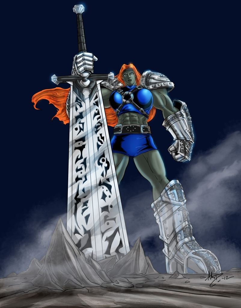
This is the original pic I was given as a generous gift, ink by Darkmoore, colour by War Griffin (credit against his will
). It's a pretty cool piece, and it's actually done for me, personally, which I appreciate very, very much. It inspired me to fire up the old Flash and give it a go, myself.Because what I'm doing is hideously tedious, all I have done right now after a solid 10 hours of fiddling over two days is this - a sword and a gauntlet. And here is where I repeat that I cannot draw, because here is where it becomes relevant. For the most part, I traced over Dark's lines, making sure to change nothing. I HAVE deviated in a few places, but most notably I swapped the scale pattern on the glove for the Celtic swirly thing, and I hope to God I got the shape and bend right.
I've put highlights and specular lighting practically everywhere. I've no idea what I'll do when I run out of metal and start working with skin, but as long as I have metal or gem to colour, I'll practically step on the speculars big time. And again - I have no idea what I'm doing. Everything, all of that which wasn't in the original lines, is done completely by stabbing in the dark and trying to reason through my lack of skill and knowledge. I think it came out pretty well, but I'd need someone who actually knows what he's doing to comment on that, and I've had some degree of trouble running this through the original creators and actually getting an opinion on it.
Anyway, that's that. The Celtic pattern wasn't as big or intricate as I originally envisioned it being, but I think it actually works pretty well with the gloves.
Quote:
|
Originally Posted by Arcanaville
Samuel_Tow is the only poster that makes me want to punch him in the head more often when I'm agreeing with him than when I'm disagreeing with him.
|
Ah okay. Well this is where you lost me. First off, I'm well aware of the difference between vectors and raster. Here is a raster coloring done in photoshop of my original pencil drawing, and here is the vector I made of the same drawing when I first learned to use Illustrator.
That said, what I'm thrown off by is your usage of Flash, while "vector capable" it's primarily an animation program. Illustrator IS a vector program. You should download a 30 day trial and play around with it... I haven't used Flash in a while, this was my sad little attempt about a year ago on my old pc. But my point is, programs like Corel Draw do showcase vectors, but the industry standard and a far more intuitive approach is found in Illustrator. It is worth using, nuff said.
If I may, when you get to the shading, stay consistent.
If your light source is from the left, keep it on the left on every possible surface it can hit. This means most or more of your shadows will be on the right. Your sword and glove has a light source from the left center, this allows for a deeper shadow on the right, and rim lighting or lesser light and shadow on the left. Your bright shiny sparkling effects or main highlights will always be left of center.
Check out these two Cosplayers I found on DA: Dark Warrior and Kasumi. I went hunting for a pose that would match your figure. In both cases the light is from the left, and the shadows fall to the right edges of her body.
Things to keep in mind the brightest colors are again left of center here, and although Kasumi has her face in shadow on the left, that is partially caused by the hair over her eye. The highlights on her face correspond with how light is traveling up her center line, which lines up - check the highlight: center of chest, center of neck, center of lower cheek.
In the case of folds, see how the white highlights on her sash are on top, and the shadows are below them, this is because the light is slightly high, in the the case of DW the light is coming from below.
Good luck with Flash, no use in you starting over in another program, but when you can try Illustrator. I use it to ink... in vectors, and then I raster those, and color in Photoshop. ( Original drawings provided by Starwind! )
Hope those references help.
LJ
EDIT: by the way, the gauntlet and sword are coming out great... are you using a mouse or a tablet? Cause I "get" the tedious part if you're using a mouse...
Quote:
I wouldn't know, honestly. Back in the day, I just got a copy of Flash from... Somewhere, I don't remember where. It was a long time ago. Since then, that's practically all I've ever used. If Illustrator is the same, only without the penchant for animation, I'll definitely look at that when I have the chance.|
Originally Posted by LadyJudgement
Ah okay. Well this is where you lost me. First off, I'm well aware of the difference between vectors and raster. Here is a raster coloring done in photoshop of my original pencil drawing, and here is the vector I made of the same drawing when I first learned to use Illustrator.
|
Quote:
| If your light source is from the left, keep it on the left on every possible surface it can hit. This means most or more of your shadows will be on the right. Your sword and glove has a light source from the left center, this allows for a deeper shadow on the right, and rim lighting or lesser light and shadow on the left. Your bright shiny sparkling effects or main highlights will always be left of center. |
From observing reflective cylinders and spheres (christmas ornaments and certain door handles are really good for this), I notice that their shape tends to reflect a VERY wide field of view, with most of the fine image actually squashed around the specular highlight centre, an the rest of the reflection stretched out and distorted, which is why they produce a "speck" of a highlight. Cylindrical, on the flip side, tend to reflect a wide field of view around their curve, but actually reflect a fairly narrow field of view along their length, which gives them a highlight line running top to bottom, with fine reflections squashed in and around it. Since I'm not actually drawing reflections, I've settled for just a highlight. Where a cylinder ends in a hemisphere, such as the tip of a finger, I've tried to approximate a highlight line ending in a speck, with varying degrees of success.
Shading is... A different story. I've no idea where cylindrical and spherical objects actually shade, or if they do at all, so I've basically resorted to giving them a specular or line shadow about on the opposite end of the object. For the most part, those actually ended up looking like reflections. The sword hilt has a shade line to the right, seemingly reflecting her head, and the glove has a shading to the right of all its shapes, seemingly reflecting the sword. At least in my head, that is.
Flat objects are... A problem. This is probably where I freehanded the most. I have NO idea how flat objects are supposed to shape, other than a very, very basic understanding of Phong Shading. Basically, soft colours are brightest nearest the light and darkest farthest away from the light, and specular highlights show up where the angle of reflection from the light source to the surface goes up straight into the viewer's eye. Which does me no good, considering this is a method for shading complex curves, which would produce a very uniform, flat colour on a flat slab. So I've resorted to the only other thing I know, which is "cartoon glass" which my friends and I practised drawing when we were, like, 10.
Cartoon Glass, my biggest memory of which is Commander Keen 7's alien office building level, typically has a flat, uni-coloured slab with diagonal white bands of varying widths drawn across it. I seem to have picked up the "wide line with two narrow lines to the sides" variant. This does, I will admit, give flat surfaces a nice shine, but I have no idea what that's supposed to imitate or what the logic behind it is. It's some combination of reflection and highlight, but for the life of me I don't know what. I basically have that, curved over the gems, the hilt and the blade just to give them a bit of shape.
And then there are edges. I've basically highlighted a lot of the edges, because any edge that's not PERFECT will be slightly vevelled, which will act like a small cylinder and gather a specular highlight ring on the tip of the edge. It makes things look more shiny
As of yet, I have no idea what I'll do with the actual body, but I hope a friend of mine who actually graduated from an art school will drop by my house at some point today and help me out with at least colour ideas and knowledge of where to put what muscles.
Quote:
| Hope those references help. |
Quote:
| EDIT: by the way, the gauntlet and sword are coming out great... are you using a mouse or a tablet? Cause I "get" the tedious part if you're using a mouse... |
I also don't actually draw anything. I start with straight lines, or a stepped shape of straight lines if I need a complex curve, then curve each individual line, snap the points into place, bend the lines into shape and, if I still can't get it right, resort to tweaking each point's individual Bézier handles. The handles are actually an easier way to manipulate curves than the basic Flash tugging on lines and points, because basic tugging makes a LOT of automatic assumptions and limits you in a big way, which makes it HARDER to get the right shape. Bézier handles are a little more cumbersome, but with them you can get EXACTLY what you need right on the first go, so it's both faster and less annoying.
It's not really as bad as it sounds. It's just a LOT of work because I make it a point to add SO MANY needless details that I manufacture my own pain. Easy example - look at the rivet on the gauntlet. That has a highlight on the top left of the shape and on bottom right of the centre hole, as well as a shadow on the bottom right of the shape and the top left of the centre hole. This gives it shape, but it's a shape that would be completely invisible when this picture is looked at from a normal distance. A lot of my details are like this, but you know what? I don't mind. One of by far the most impressive moments I've had with great artists is when I obtain a much higher resolution of their art and marvel at all the fine detail that you can't really see from afar, but actually makes the pic as impressive as it is. I'm not a great artist, clearly, but it's something I enjoy just the same. After all, I went with vector graphics in order to get "unlimited detail," right?
Quote:
|
Originally Posted by Arcanaville
Samuel_Tow is the only poster that makes me want to punch him in the head more often when I'm agreeing with him than when I'm disagreeing with him.
|
Yeah I smooth out curves in Illustrator with a special tool, kind of looks like a pencil, but you can't draw with it. It just lessens the amount of nodes in a curve or straight line, depending on how you "wand" over the stroke, and the direction you go. I've used the bezer handles, but only when I have to... since I free hand, expand it all to resize and then raster at the end, the node count doesn't effect me for the size of the file, even though I work huge.
When I do work entirely vector for that second link, it is all about the pen tool for as many straight edges as I need. But they have taken my digital vector "inks"... I like coloring in vector, but it's not my favorite thing, and I have NO patience for meshing, which my wife is the Queen of... ( check out one of her vector meshes )
If you like I could photoshop shade your friend's piece, with a high left of center light source. It's practically a "flat", and wouldn't take more than an hour. You could use it then as a guide...
Quote:
If you'd like to, that would actually be great. Be a little less guessing for me, which should make things easier. Might also clue me in on a few shapes that I'm kind of struggling in at the moment. I got sort of held up by the shoulder pads, and I'll need to wait for my artist friend (the one who hasn't even seen the pic) to come by and give me a hand with it, since I'm completely stuck.
| If you like I could photoshop shade your friend's piece, with a high left of center light source. It's practically a "flat", and wouldn't take more than an hour. You could use it then as a guide... |
Quote:
|
Originally Posted by Arcanaville
Samuel_Tow is the only poster that makes me want to punch him in the head more often when I'm agreeing with him than when I'm disagreeing with him.
|
Keep at it Samuel and we look forward to the finished piece.
P.S. Yay LJ for the assist!
Quote:
Looking at the pic as a whole, the shoulder pads should be my last real stumbling block. Their shape, dimensions and orientation is throwing me completely for a loop because I CANNOT get a picture of how they should look in my head. I assume Darkmoore did them freehand, which is what sets real artists apart from someone like me, because I CANNOT freehand them at all. Very much literally, I have to ray-trace them, or I have no idea what they're supposed to look like. That's more or less how I did the sword hilt guard - I traced over the visible side of it, them just mirrored the edge, traced the visible lines into the invisible part and hooked the mirrored edge onto them, copying the distance between the hilt curve and the blade on the other side to find the proper position. In other words, I did nothing by feel, but rather essentially plotted where things should go.|
Originally Posted by ChristopherRobin
Keep at it Samuel and we look forward to the finished piece.
P.S. Yay LJ for the assist! |
I haven't found a good way to trace the shoulders, because I haven't found a good way to trace over and comprehend their shape. Once I figure that out, the rest should be doable, as the other shapes are a lot more straightforward to picture. I hope my friend will come over and school me tomorrow, because I am literally stuck without him. I suppose I could just skip the shoulders, but I hate to have to go back and draw over my own work, as that's really harsh when I've added too many points to draw over.
But, yeah, if everything holds up and I keep at it, it should be done eventually.
Quote:
|
Originally Posted by Arcanaville
Samuel_Tow is the only poster that makes me want to punch him in the head more often when I'm agreeing with him than when I'm disagreeing with him.
|
Well I tried shading it, but here's the problem, whoever colored the original line work, did not go to the edges of every separate shape. So what you have are jagged uncolored halos everywhere. Now you might just say, well couldn't you color those in... actually I could and had done all the blue areas, that took an HOUR!
This is because the person didn't do it right the first time. And I really don't feel like fixing their mistake. HOWEVER. It would be infinitely easier for me to recolor the black and white version, as I know what the heck I'm doing! SO, if you have that for me, my offer still stands, and I will use this color scheme to color in the figure, shaded and all.
But I'm not on the clean up AND coloring crew. Apologies but the only other way around this mess is a plug in I've never used and not sure how to use, OR re-inking the whole thing myself... that would be a pain.
Anyway here as I said was as far as I got...

Send me the linework, and I CAN and WILL fix it. But otherwise, good luck, and breathe deeply...
LJ
First things first, please let's not criticise the picture, itself. It was done as a favour to me for free and out of the goodness of their hearts. It is what it is, and I'm working on it as best I can.
Of course, I do have the original line work. Here is a resize down to a file size I can upload on the 'net.
Also, and this might sound weird, but what you have so far helped me greatly in one particular regard - fixing the crotch. Aside from the shoulders, this was the other big thing that I could never quite see past, but since it's somewhat difficult to describe, I opted to not mention it for the time being. I tweak things here and there as I go, and I'll probably tweak that, too.
Also, if you do a full flat of this, I'll probably want to repost it back to the original creators, and I have to ask for your permission to do so. It may be a formality, but I have to ask nevertheless.
Quote:
|
Originally Posted by Arcanaville
Samuel_Tow is the only poster that makes me want to punch him in the head more often when I'm agreeing with him than when I'm disagreeing with him.
|
I have NO probelm with the original drawing OR the color scheme, it's the WAY it was colored that another colorist, such as myself would find annoying as it wasn't done correctly. That's it plain and simple. Since I myself have made this mistake when I first learned to color, it came from 2 things. Not knowing what to do, and using a program not exactly designed to color more efficiently.
In basic terms - the black line has to sit on a layer above the flat base colors. This separation is crucial for two reasons. This way one is not mixed with the other, and both can be corrected if something needs to be changed.
But great that you have the original line work, I am drinking my coffee (sorry went to sleep at 7am) and will start flatting it to the original colors. I will try to match the shadows I made on the last one.
EDIT: Finished version started in another thread. Hope you like it...
I'm working on sort of a side project here, trying to essentially copy over a pic a friend of mine gave me of one of my characters in Flash, and I'm kind of stumped on exactly what the pattern for the medieval ornaments should look like. In-game, it's too low-res to tell and I haven't found a good way to get a close look, anyway.
So, can anyone tell me exactly what pattern this is?
Keep in mind I'm no artist and I've no actual skill in drawing, I'm just handy with Flash. So while the person who gave me the pic seems to have been able to free-hand it, I'm completely unable to do so, and I need some kind of guide or pattern to even begin trying to trace over it. If I don't know what it is I'm tracing over, I can't put colour over it.
So far, to me, it looks like just a series of interlocking, overlapping circles forming a sort of repeating Celtic cross pattern, but that still doesn't help me actually picture what it looks like, and so gives me no ability to reproduce it. If anyone can help me out, that'd be great.
*edit*
I'll see if I can get permission to show you the pic in question.