
Lousy_Day
-
Posts
365 -
Joined
-
Wow, I love Elvgren's works from late 40s-60s. He has both qualities of what I liked about Runci and Medcalf. Also love the facial expressions. I guess his style is what I am going to try to emulate...or have an epic failure trying.

-
Oh you want your tongue to look like Cai's avatar, CR?

Scooter, you get to brag that we both represent Victory (although I have been pvping a lot on Freedom lately. Bad devs for giving us free server transfers instead of making pvp zones global. They killed pvp on other servers with that move, and I think it was intentional. At least our penguins are popular in Sirens on Freedom now...) -
Thanks Foo. I know almost nothing about pin-up artists, so I could certainly use some pointers. I will have to remember the toe-pointing.
thepinupfiles.com looks like a great resource for references. After checking out some of the galleries, two artists whose work stand out to me are Edward Runci and Bill Medcalf. Runci has amazing edge control, and I like the interesting backgrounds in Medcalf's pieces. Were they big names too?
Who's the artist that did Viv's favorite? -
Hehe, I'm sowwy for stealing all your Victory votes Scooter. Like Grey said, you picked a very difficult pose, not just the pose itself but the angle too. From what I read you were just starting to draw? You did a wonderful job considering that. Good luck next month.

As for setting the bar high, that's exactly what I wanted to do. Honestly, I felt a lot of people weren't putting in as much effort as they could/should have in some of the later months last year. You begin to lose interest after a while if you are trying to do the best you can and it seems like others are just trying to get by. So I am going to do what I can to bring the best out of other artists while I'm still self-motivated.
I had my personal goals too. When I got the idea for my piece, I thought I had a small chance of being able to pull it off, because I had started but never finished some ambitious projects in the past. But what I had this time that I didn't have the other times was the sheer determination. And now that I've done it, I am going to be able to plan for bigger and better things in the future.
I not trying or expecting to win every month. I most certainly won't be able to put in as much effort every month as I did this month (10 days of studying figure skating poses and dark lighting, and a week on the actual painting.) But I would like to think that what I did stirred up something inside the other artists. Clutch said yesterday that he had already put in 7 hours on his February entry. Have you seen his gallery? He has some impressive stuff there, and I am scared to see what he comes up with this month. I have a feeling that a few others will up their game too. As for me, I am going to spend 2-3 weeks studying the classic pin-up style before starting on my piece. February will be an exciting month to watch unfold, and that, for me, is what this competition is all about. -
Quote:I still like my idea, but it's not quite what Wassy had in mind for the month. I don't want to cause any forum drama, so I am just going to try to do the best regular pin up I can. Figured I could learn more by devoting the month to studying pin ups anyway. I've been wanting to do commissions for a very long time, but just never felt I was ready. Hopefully this will get me closer to that goal.Originally Posted by Juggertha
 hmmmm, maybe my idea is too dark then as well.
Is Foo not competing this year? -
Both subject matter and colors, I guess. I have a general idea that I really like. I have no clue how it will end up looking, but I have a feeling it will be on the serious side, although there will be no blood or gore. I will run it by you in PM before I develope my idea any further.
Actually my first idea involved a couple of skunk characters cuddling, with people around chocking. The title would have been, "Love isn't the only thing in the air..." But then I realized most people wouldn't see a hot chick in a skunk, even one with a jasmine perfume. I also can't draw animals, which is too bad since almost all of the characters I play are animals. -
Aww, I was hoping it came with Corel Painter Sketchpad. It had the most natural feeling digital pencil when I played around with the trial version last year. I just checked their website, and I totally recommend against buying it, though. It's a fun little program that would make a great bundled software, but definitely not worth the price they are asking for.
Well, have fun, and I hope (demand?) to see some of your creations soon.
-
What are you waiting for?!?! Does it come with any software?
-
I looked in options, but I am not sure where to see if it is enabled or not. So I guess this is just my computer? Maybe I should PM you instead...
-
I'm on my home computer. Yes I can see that image. I actually see the small thumbnail on the right side going through all the entries, but all the other images are red X's, and I can't click on January to see all of them at once like I could in Firefox.
The main site looks fine, but when I mouse over the menus (Home, Commissions, etc.) a red X box appears again but I can still click them. -
Congrats Viv!
-
8.0.6001.18882
-
Quote:Guess everyone uses Firefox? I only see a bunch of red X's in IE, but everything's fine in Firefox.Originally Posted by Wassy
I've uploaded all the pieces to the FArt Competition 2010 page on my website
I used the artists' comments from dA and added my own thoughts to each piece. I get traffic from other boards and stuff that I visit, so hopefully it will bring you guys even more acclaim. Check it out! -
Quote:Does this mean you will be disqualified if your image is kinda dark?Originally Posted by Wassy
What I said about fantasy, fun, frivolity still applies. I don't want any Romeo & Juliet suicides or that sort of thing. Keep it light-hearted (pun intended, so eat it!!!).
-
Yeah I didn't vote when we had to pick one to eliminate.
I really like DarkEther's first idea, but maybe only count votes from previous 1-3 months rather than from the beginning. -
Frost gets my vote.
Other ones I really liked are Happy Dan, Eddy Swan, and Juggertha. -
Happy Birthday Wassy!
-
If one of the swimmers had a tattoo of a hot chick on his body somewhere, would that be enough to meet the requirement? That would be a quick fix without adding or changing too much I think. It would be a shame to get disqualified this month.
-
Not trying to win any popularity contests here, but I do appreciate all the comments. I was feeling rather crappy after unintentionally staying up all night, and what everyone said here and on DA made my day, so thank you.
Now, I am looking forward to seeing everyone else's. Only 5 days left! -
Dance of the Nightshade
I could polish a bit more, but I think I am done with it at least for a few days. I worked on it all week, and after staying up all night, I'm tired of working on it.
Oh, before CR points out (), when she spins, the 6th sequence is holding her left arm up, but it was supposed to be her right arm. I kept it because I liked the pose, and thought making that her right arm and adding another arm would detract from the motion.
-
Post yours please, Juggy! It's too much pain to wait for a piece I know is finished. If you submit early, if someone has the same idea as you, you know you weren't affected by their work. Ironically, I'm doing figure skating, too...
-
Thanks, I think I figured it out.
-
So you need to submit your entry twice, once in your own gallery and to the group?
Scooter, I will gladly be the first if you can wait till the end of the week. I only got started on the actual piece yesterday, but I did a lot of studies before starting, so here's hoping it will turn out good. Should be able to meet the hot chick requirement anyway...
-
It is very important to understand value (light and dark) because that is how we perceive form.
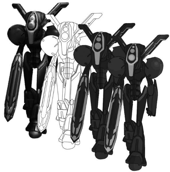
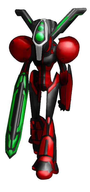
I turned your first image to greyscale, and if you squint your eyes and look at your rendering, I see 2 greys, and the lighter grey is where greens are. These greys do not describe the form very well, which is why your image ends up looking flat. I'd even say the screencapture you started with doesn't have the most well defined values either, perhaps making this more difficult for you. Another issue I had with your second attempt was the very bright and saturated red parts, missing any highlights. In order to make red lighter, you'd have to lose some saturation.
I thought about how I'd approach this if were you, and I decided to try different layer blending modes, since you were already using different layers.
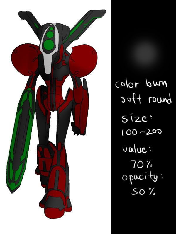
First, I add a new layer and change the blending mode to "color burn". With a big soft brush, I quickly go over dark areas.
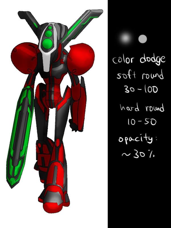
Next, I add a "color dodge" layer. I start with a soft brush that is still pretty big, and work my way in with smaller hard brush for details. I am noticing that the red parts don't get any lighter in this mode, possibly explaining how you ended up with those bright reds with no highlights.
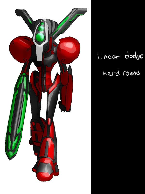
So I add another layer for highlights, in "linear dodge" mode.
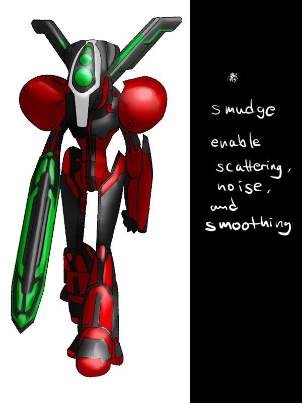
Next, I smudge some rough edges in the two dodge layers. The default setting for the smudge tool sucks, so you need to tweak the settings a bit. Main thing is change the brush shape to a textured one like in the picture, and I think I had Exposure pretty low, maybe 15-25%.
I decided that the darkest areas could be darker, so just did that. I think I oversmudged and lost some crispness. I will do another one from scratch, but this time without smudging. Another thing I will do differently is, since we are working with "color burn" and "color dodge", why not add some color to light and shadow?
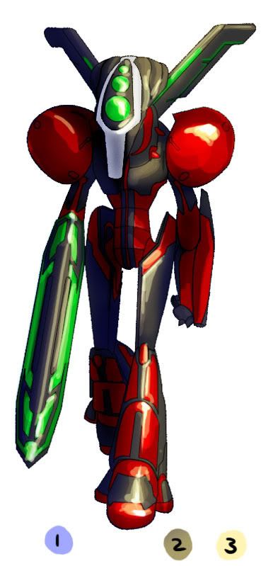
1 shows the color I picked for the shadows in color burn layer, very light pale blue. 2 is for the color dodge layer, a darker yellow-grey. 3 is for the highlights, but I used "hard light" mode instead of "linear dodge". Lastly, I directly painted brightest highlights with a white hard round brush.
This is in no way a definitive process, as this was my first time working this way. I was just trying to come up with a method that might work for you, so keep experimenting and see where it goes.
-
Hi...umm I thinnk your name has changed...what do people call you now?
I've been slacking, but trying to change that. I have my own new years resolution, and hopefully the results will speak for themselves soon. Ok, I am going to go spend the last 50 minutes of 2009 and start off the new year by painting stuff. Happy new year!