
Caemgen
-
Posts
3369 -
Joined
-
Quote:Originally Posted by DemonCaller
 I have only one thing to say...
What have I started now???
(watches the swimsuit thing snowball...)
Ok, ok... No swimsuit editions!
Still... Free arts!!
I've got four commissions by Spidey0318 to give away! These aren the full Uber Omi treatment commissions but even the normal, comic pin up/no background Omi arts are better than if I tried to do them myself! o.0 Who want's them??
If you're interested in having one just post up a link to their reference shots. No contest this time. Just me picking four lucky winners. Some preference will go to those who I haven't given art to before, some preference to those whose characters I think look cool. Some preference to *shrug* whatever. Not sure how I'll decide so just post if interested.
The only requirement is that you have a character in Heroes Studios SG or Gallery of Rogues VG. And unlike last time, I'll give this at least 24 hours before closing it so that everyone has a chance to get in if interested... -
Having not been started on July 8th of last year, I ding this all kind of pointless...
-
-
Actually Caemgen wouldn't be my first choice to make a movie out of... He's got to much of a broody/angst thing going on and those kind of movies have been done to death Besides, I still haven't really fleshed out his full story yet...
I'd make a movie of my character Fenian...

The basic story would tell the tale of how/why she decided to actually start using her powers. The powers caused her to run away from home at an early age and she faced many/all the troubles a 15 year old would face trying to make it on their own. However, she manages to build up a strange little family around herself including her lover, the director of the naughty films she acts in and various other members o that "community." It's not the perfect life but she's found some happiness... At least until the Family tries to muscle in on her town, threatening her little bit of happiness. She comes to decide the only way to get rid of the Family (and protect her family) is to kick them the heck out of dodge.
The film would probably end on a mixed note... She's successful (if bruised) in her struggle against the Family and has shown them her town wouldn't be profitable for them after all, but she's also made an enemy out of them and the Family doesn't forget grudges - profits or not! So while she basks in the glow of having saved her little family she also knows that if she stays with them she'll just be bringing trouble back onto their heads...
I view Fenian as a lower powered hero... So even with her powers taking on the Family would be a real, gritty kind of battle. She's not there to save the world from cosmic powered would be gods but she can damn well take care of her own streets! -
New Stuff already, this time in more classic Superhero type art
The following were all done by Snareser who is over there on Deviant Art...
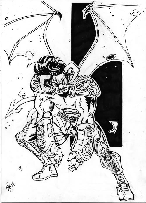
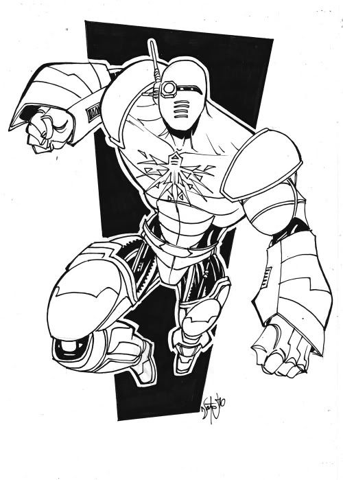
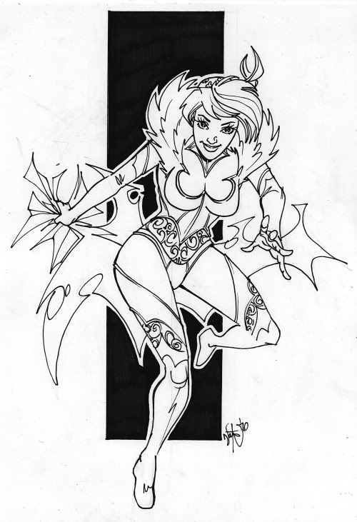
Not totally in love with how Caemgen's face and hair turned out but overall I'm pretty happy with there And I must say, the turnaround time was amazingly quick...
-
Quote:Bah, I bet you even dream in color... Err, wait. That makes no sense... Anyway, love them as is but may decide to try color just to see... Haven't decided yet.Originally Posted by Eddy_Swan
I was thinking color. but yeah... you'd have to check for fever if I wasnt. :3
And Viv - you know what they say about with big feet, don't ya?? Not sure how that applies to Fen though... -
Quote:Originally Posted by ChristopherRobin
Tick Tock, Tick Tock, only 12 hours to go and I still need 5 pieces to successfully reach my New Years goal on time.
So stop posting and get to drawing, art-monkey!!!
-
Quote:Very lean and lanky indeed but I was expecting that. The artist expressed concern about Caemgen specifically and his (the artists) lack of experience doing really muscled figures. He warned he may have to slim him down and I told him no problem... I had of course checked out his gallery before hiring him and had noticed his style was all about long thin bodies... Besides, I think to a certain extent artists tend to buff out Cae a bit more than his pics really dictate but that's one of the things I don't mind being modified to suit the pic...Originally Posted by CRA cool new style to see the trio done in. I like it, it's very minimalist and clean.
The figures are thinner and lankier than usual but not overly so. Also I like the sepia look as well and those are some pretty unique wings on Caemgen.
Caemgen has a human nose though... Alpha's helmet monocle is missing (and so it the white stripe in his hair/beard)... Fenian's pinky is longer than her other fingers and oh yeah and she has 4 leaf clovers on her hat... ahem.
And yeah, I love the sepia kind of look... I think it works particularly well with this style (specially Caemgen.) His wings are definitely unique here... Hardly even wings at all really but I think they look pretty damn cool and work well with the style. The horns aren't dead on either, pointing up too far at the end curve But again, they look pretty cool and to a large extent that's the main thing.
His nose is indeed very humanish... I may just need you to draw me a Cae Nose Primer I can pass along with the horn sketch ya did
To be fair, the Alpha white in his hair missing may be may fault... I don't think I was expecting him with the helmet off so may not have included that note. I really should write the notes up and save them along with my gallery addy's but I usually end up doing them off the top of my head each time. You'd think someone as lazy as me would take this effort saving step... But the procrastination kicks in And yep, just checked the notes exchanged, the white streaks weren't mentioned... Which actually means the blank eye is odd since the artists didn't know he had a bionic eye! lol... As for the helmet monocle, yep yep... Errrm, all three of these look like younger versions so maybe it's an earlier version of the armor?? (could explain lack of white streaks as well... but not really.)
The pinky? That's foreshortening!! (or not... lol)
Four leafs?? Ayup... I was going to mention that while posting the pics but I figured I'd let you have that joy. Maybe the Vietnamese don't have regular clover??? *shrug*
Quote:Originally Posted by VexXxaOMG CAEMGEN!!! Those are so totally BEAUTIMOUS!!! I love all three of them equally....well, maybe I love the Caemgen a tad more!! Gratzzz!!!
I do believe this may be the first B&W art I did not see you ask about being colored!!!! I am shocked! lol...
If I had to choose, I would probably pick Cae as my favorite out of this bunch as well but it would be close... But I like his pose, how it's not just a straight on shot and there's the sense of movement to it...
And glad you like...
Thanks. I'm not always a huge fan of pretty (or beautfiful) art but I think it really works here and by this guy in general... Normally I like my guys looking... err, more manly I guess. lol... But grizzled and muscley just seems wrong for these arts.Quote:Originally Posted by PowerstreamThese are absolutely beautiful. I love the Alpha one. I get a Post-Apocolyptic Knight vibe which I think is totally cool. Definitely my favorite of the three but all are great! Where ever you put these up in your house must be getting pretty full by now!
And funny, I got a similiar vibe from the armor... Except the big old gloves, it almost has the feel of one of those armors that somehow expands out of a belt buckle or something.
ThanksQuote:Originally Posted by Red ValkyrjaGorgeous, Caemgen. Congratulations of the lasts acquisitions. I really like trying to add non-comic style arts to the gallery and was thrilled I was able to convince Clap-san to give these three a shot.
Thanks. I do generally try to avoid the bad artists...Quote:Originally Posted by BayaniHmm. Not bad.
As I mentioned, all three kind of appear to be younger versions of the actual characters but I think that was inevitable with the artist. If I was worried about all my art fitting my characters actual canon I probably would have passed on this artist nut personally I'm more about getting what I consider cool arts of the characters than in sticking to the canon... Though I suppose I could always call these the Praetorian versions
As noted above, there are a couple of quirks that I probably would have asked be corrected if there was draft approval but even with those quirks I really am loving these three pics and at this point I don't think any of them are worth trying to get changed...
And coolness... I missed the fact that I would be getting the originals sent to me
-
How exactly does one double post 12 minutes apart?
-
Have a happy!
-
And the latest are by Clap-san from over at Deviant Art. Comic book art is not his typical style at all... He was a bit hesitant to tackle my trio at first but agreed to give it a try. His style definitely shines through on these pieces.
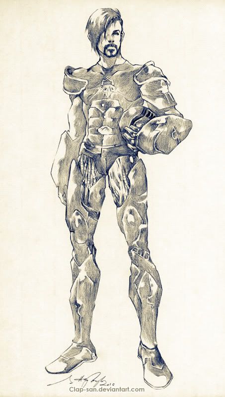
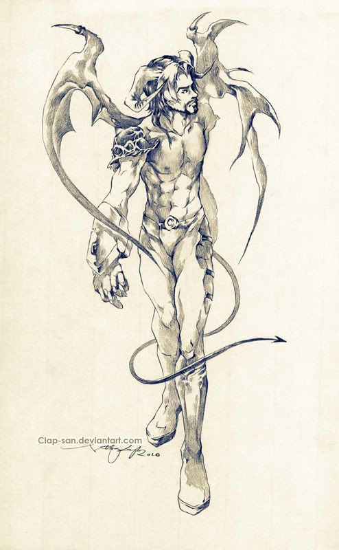
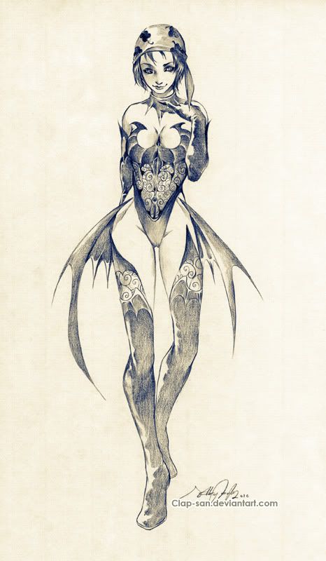
(Hopefully these images are ok, didn't get the hi-res copies yet... And I may come back and have more to say about these later but right now I have to scoot and go get ready to watch the USA vs Canada hockey game for the gold!) -
Quote:Looks like he's 7 sketches away from completing the goal... (though it doesn't look like he'll do it on time *shrug*) so it couldn't hurt to read his sign, go to his other thread, and post the references. He may finish the 40 even after the deadline... And I certainly don't expect him to stop drawing altogether after the 1st... So worst case, you post some references that get ignored. Best case, you eventually get free arts. *shrug*Originally Posted by Cuppa_LLX
so i'm gonna take a stab in the dark and guess I to late to thow my hat in?
-
Quote:Originally Posted by DemonCaller
My question is would this be screenshots or an actual Art thingy?
I remember SWG had several servers with pin up calenders in the day-often screenshots with some airbrushing...
This is an example (please excuse the size-) This was an entry that I got in too late for one year's calendar.
((pic deleted for space))
Often, once the toon was accepted, the screenshot would go into photoshop for some 'cleanup' work.
And I am not sure this would work for CoH toons...given the character creation system in this game.
Eg: This is Mellissandria (Paragon City edition)
((pic deleted for space))
Actually I was joking when I first mentioned it but then I got to thinking... It could be kind of cool to get a bunch of swimsuit arts done So now I'm kind of keeping an eye out for a good art deal or two I could leap on to get enough commissions spots to do it without totally busting the bank.
-
HELP!!
These maniacs are holding me against my will and threatening to drag me across the universe to attack some aliens or something... They claim my magical powers are needed. I keep telling these wacko's that the quater behind the ear and I got your nose tricks are just slieght of hand but they won't believe me!!
Please, please, please read this before you shove it in the time capsul and send someone to get me away from these nutjobs!!!
Signed,
Marvin the Marvelous - Stage Magicians
Available for Birthdays and Bah Mitzvahs
Local Jobs Only! -
Quote:You know it! Caemgen got a taste but he still wants the full Wassy! And poor Alpha has nothingOriginally Posted by Wassy
If I opened up a few slots to do quickie sketches, would people be interested?
-
Quote:Hmmm, we really do need a CoH Swimsuit Edition ..Originally Posted by DemonCaller
... and for me to save her current costume model with a bathing suit for summer
-
I'm picturing Mel as a meat doctor, Flo as a member of the Carnival and Vera as one of those citizens who is always running around in a panic, even after you've cleared the room.
-
Quote:Naw, I'll just sneak your photo into my entry somehow... ,)Originally Posted by StormVyxen
This just means you need to work on your Hot Chick Stick Figures.
-
Wow, drama on the Internet... Go figure*
Anyway, this will be my final comments on this bruhaha as I want to take one last stab at clearing a couple things up but have no desire to have a lengthy debate on what boils down to personal opinions and tastes...*
Art is always subjective. What one person likes may not work for the next person. Each may be able to clearly point out why they do or do not like a particular piece of art and even when they disagree on a specific point it doesn't neccessarily make one person right or wrong. Art is art. It is not math where there is a right and wrong answer. It is not science with provable facts. If art was NOT subjective then there would be no point to have voting in a contest.
Part of the subjective nature of art also means that some likes and dislikes of an individual may not be based in cleary explainable thoughts or points but may be more emotional or gut reactive... Just as you cannot convince a person to fall in love with another (they either feel it or they don't, facts won't change it) so too is art often liked or not on a more indefinable basis.
I have no problem with people feeling I am wrong for going hardcore on the theme to decide who got my votes. It was a theme, not a strict assignment, so there was some leeway for the artists to explore as they saw fit. My choice to kind of limit myself to the most strict definition was arbitrary and thus I see no problem with people disagreeing with me on that...
I would like to point out again, however, that I only came to this arbitrary, self imposed limitation after the month became a non elimination month and immunity was all but in the bag. Basically after I felt my vote had little or no relevance. That being the case I decided to make things easy on myself and hold myself strictly to the most strident interpretation of the theme... If portions of what was being voted for were still in doubt I would have judged on a different basis...
"For this month's theme, I'm looking for some classic pin-ups." - Wassy
Sure, she went on to allow artists to stretch the theme and as Fan Art Mistress that is totally her right. However, I also believe it is my right to make my judgements on the basis of what I like and dislike, what I felt best fit the theme and what I ft strayed too far and which arts I liked best based on my own feelings, opinions and likes. Sorry that so many of you disagree.
I suppose I could have just kept my mouth shut and voted for myself and the people I liked best... Or shut up and voted for people I thought would be easy to beat down the line... Or whatever. That just isn't me though. I will vote for those I think did the best job. Period. That includes a combination of best fitting the theme and best art.
Some disagree with how strictly I enforced fitting the theme and that is fine. Personally I have more problem with those who base their votes on things that have nothing to do with talent of fitting the theme but since the board citizenry isn't up in arms over those people I guess I am the only one...
Ah well, that's my general thoughts on the topic, now to get to specifics..*
Battlewraith/Frozendeath*
On the cropping issue:
As I said before, to me Eddy Swan's cropping appears to have been an artistic decision while Dan's seemed to come off more unfinished than choice. This is my interpretation of how it looks and I could easily be wrong... However, I can only go by what I see and how I see it, how it works for me. Unless we're going to hold interview sessions with each artist to delve into their thoughts and intents I'm not sure what else I should do.
And sure, both cropped... Both used the same technique in essence. Are you going to tell me that two different artists using the same technique inevitably pull it off equally as well?because the difference between the two, in my opinion, is how well they pulled it off.
Spiral PTterns and Quick Reads
First off, I apologize for not being sophisticated enough to properly hold opinions and thoughts on art. However I do not believe sophistication was a requirement for voting in the contest. I thought Wassy's rule was pretty much just that you had to have a message board account...
Snarkiness aside, I wish to express again how much I really liked your art. I thought all of the elements were done exceptionally well and I loved the added touches. Hell, I've admired your arts since I came to these boards and have been eagerly waiting for you to open up for commissions...
But your explanation of the spiral pattern just kind of proves to me why I didn't feel your piece was one which best fit this months theme. To me, a pin up should focus on the subject - generally the girl. As was your intent, my focus moved around the picture instead, drawing focus from the girl. It is a great work of art just not, in my opinion, one of the best pin ups.
I respect your right to disagree with me going with the strictest adherance to the pin up theme... However, even with the looser theme I probably would have kept in mind if the elimination for the month wasn't eliminated and immunity all but decided, I'm still not sure I would have thought your piece fit the theme...
The theme was pin ups and was open to loose interpretations of pin ups and related materials but to me your piece is in action scene. An action scene with a hot chick as the main subject and with some comedic elements thrown in but not, to me, a pin up.*
Well, I suppose it is a pin up in the comic book sense of a pin up being a page or pages basically designed to be taken out and put up on a wall but Wassy expressed that she meant classic pin ups -"For this month's theme, I'm looking for some classic pin-ups. I'm thinking along the lines of Alberto Vargas (or Olivia DeBerardinis for a recent example). Think fantasy, cheesecake, frivolity, playfulness." and I personally feel you strayed too far from that field...
I hope you understand that there is nothing personal in my voting or decision making process. I have absolutely no problem with you and am always glad to see your arts, your comments and even your libestreams when I can make them. I find you very interesting and knowledgable. I respect your right to hold different views, opinions, feelings and beliefs than I do... *And I most definitely grant you are more knowledgeable about art than I am. That being the case I still bieve my thoughts, opinions and feelings are valid. They may not be right but then again I believe there is very little absolute right or wrong when it comes to individuals likes or dislikes of art... Though I could be wrong about that...
Aggelakis
First off, I do not believe that is an actual quote of mine. There are ways to quote someone and yet indicate that's parts of the actual quote were changed for the sake of brevity, comedy or whatever. *I would appreciate that courtesy in the future. I can get enough heat for my own words, I don't need extra for being misquoted.
Secondly, this was indeed pin up month.
Quote:Sound pretty pin up monthy to me...Originally Posted by Wassy... and restraining orders are being processed! For February we're going have a little romance, and the option for a little extra. Yes, in honor of Valentine's Day, and because I'm very bad at delayed gratification, the long-touted pin-up month is NOW!
For this month's theme, I'm looking for some classic pin-ups. I'm thinking along the lines of Alberto Vargas (or Olivia DeBerardinis for a recent example). Think fantasy, cheesecake, frivolity, playfulness. Your piece does not need to be a direct pin-up, but must be in relation to it.
Romance was a secondary theme and going by a strict interpretation of the originly posted rules, romance was only for those with moral objections to pin ups.
I'm not sure if this is why it was a glaring void in the commentary or not but I thinks it's justification enough for me not needing to rethink all those comments I made.Quote:Originally Posted by WassyIf you are deeply morally opposed to the world of the pin-up, a piece centering on romance is also acceptable.
In conclusion, I really have no idea why I feel the need to justify the basis on which I voted. Ok, I was stupid enough to say it aloud... *But I believe I made my decisions based on reasons od art and theme, perhaps not reasons anyone else agrees with but at least I did use those criteria. Meanwhile we have people voting for themselves, at least one person I recall stating they would vote for a specific person no matter wha, and who knows what else being used as voting criteria. I do not wish to start debate on other voting methods but I do find it very amusing that it is one that actually uses the art and the theme, in whatever manner, that is being questioned and attacked.
I intended my comments on each piece mainly as praise and I didn't think of any of my comments as criticism so much as just my thoughts or opinions... Anyone who has seen my art should know I have no basis to criticize others. I apologize if anyone took my thoughts and opinions as attacks - they were most definitely not meant that way! *I will not apologize for my thoughts and opinions though. * And shame on anyone who ever does.
I'll not be responding I. This thread again as I never meant to cause drama and this is not the place for it. *If someone wishes to further have a discussion on the merits of feeling, thoughts, opinions et. about art and starts a thread just for that, I'll happily join in, but barring that I sha from here out hold my tongue (and fingers) on commenting on any art on these boards in any way unless I know explicitly that the artist wants to hear my opinion... It's just not worth the bother otherwise. -
Quote:Originally Posted by FrozenDeath
Sorry I can't help commenting on this as well:
Caemgen, your number three pic is Eddy's, which lacks feet, hands, and heads.
Wow... note to self: Keep your mouth shut in the future!
Seeing as how none of the arts give us a full 360 view of each subject from each and every angle, possible or not, every pic has something missing...
In Eddy Swan's pic the pieces that are cut off are done so by the border of the image. The positioning of the border also seems to have been done very artistically. To me it is as if the point is that these could be any two enemies who are yet drawn together. The pic, to me, seems to be about the attraction, or maybe just pure sexuality, and that of foes coming together... And which specific person each of those foes were seems kind of immaterial to the point of the pic to me...
In Happy Dan's art it just appears to me as if the legs were missing, that he didn't get around to them or didn't know what to do with them. He may have thought the image worked better that way artistically, I am certainly not going to say I am inside any artists head, but I can only go by how the image reads to me. I would have prefered a fade out of the leg - The way the costume just defines the lower body of the subject just didn't work for me at all...
But, end of the day, it is quite possible that some of my comments are contradictory and while I don't mind explaining my views, I don't apologize for not being 100% consistant. First off I'm not an art critic. Sorry I added comments regarding those I didn't pick but I wanted to explain a bit how I felt about each of them. I actually thought I was trying to be constructive and complimentary for the most part. I will not make that mistake again.
Secondly, what works for me in one piece of art may not work for me in another. Hell, I hate tie dye but that doesn't mean I haven't seen the occasionally hippy chick wearing it and making it look damn good. I am not a huge fan of chibi's but there's just something about Deeb's style that really makes them work. *shrug* There is just something about art that almost forces contradictory opinions from one piece to another from time to time. -
Quote:It was indeed a full scene but the background elements didn't grab the eye and attention in the same way. They completed the scene but weren't as worthy of attention and study.Originally Posted by Suichiro
I think this is the real issue.
LD's pic was a full scene, which according to that logic, should have been out of the running. Opinion is opinion, but that's flawed logic.
It's not that there were other elements to the pic so much as how much those elements drew attention away from the model who should be the focal point.
Just like I couldn't really write a pin up... I wouldn't have voted for myself under this criteria either.Quote:Originally Posted by FrostYeah. I'm kinda wondering how I can graphic design up a pinup (With my particular skills being more in the layout department and less in the illustration area) You're lucky you got what you did!
Still, it's a reasonable criteria for this month.
I was looking for the most pin upy of the entries with the best arts. Didn't mean to imply other entries weren't good or weren't worthy of consideration, just how I myself whittled down the field after elimination was negated. If it was still an elimination month I probably would have taken more care not to cut out entries which I felt fit the theme fine... But since it was gone I felt fine being more hard core about the theme than was strictly neccessary. -
Hmph, ya, does seem kind of harsh pin up only rule I imposed there... But once this became a non-elimination month I just decided to make it easy on myself...
And hopefully you don't take me calling you art a scene rather than a pin up as some kind of insult... Like I said, I loved the piece and all the details in it from the pong on the TV set to the hula hoops and donut. My point was kind of that the whole scene is something that deserves attention where as in a pin up it should pretty much just be the model that has your eye lingering... -
1) Clutch
2) Lousy Day
3) Eddy Swan
1+2 basically came down to a coin flip... but in the end how can I not vote for lesbian spanking???
I pretty much threw out any pic that had more than the pin up itself. I know it was just a theme and it wasn't restricted to pure pin ups but that was what I wanted to see. *shrug* Unfortunately most felt the need to add more than just the hot chick in a tantalizing pose... Well, maybe fortunately, it did make my choices easier.
CR - You may have edged out Eddy if you hadn't included the schedule book... And some kind of background would probably have helped as well.
Battlewraith - I love your pic but to me it's more of a scene than a pin up.
Pyro - Very nice job, actually a bit better than I expected. (err, I mean that in a good way!) The pic had a kind of naughty postacrd feel to it which didn't neccessarily get it out of the running for me but I think you lost some points in my head since I'd recently seen a Naughty Nadya pic that had a similiar theme.
U-Naught - I like the calander idea though I think it would have been better if the calendar part was included more, kind of looked odd just having the top part of first row... Also, Brutal Wendy looks more quirky than hot to me.
Cresent - Errr, the churning butter thing kind of threw me... Also, without the comments, I just didn't see a CoH connection besides the logo on the butter churn and that just seemed too thrown on to count for me - CoH (in my mind) should be a real part of the work, not an add on.
Happy Dan - I think I mentioned before that this has a Rosie the Riveter feel to me, which is good, but you were up against some stiff competition... I also think even the lack of suggestion of legs didn't work well for me. *shrug*
Johnny Kat - I really like the merging of Carnival and Pirate, that worked really well... But I just didn't feel it was needed for this. Carnival chicks are hot enough as is... I also think the sexiness factor could have been more prominent.
Toxic Shia - Nice work, nice pose, nice subject matter... Just didn't quite pop enough for me. I think I would have prefered less words and some kind of background...
Frost - Great idea and execution, but like I mentioned earlier, I was personally looking for more pure pin up. (Kind of hypocritical considering my entry, I know... But I didn't vote for me either)
Implicit Bookcarrier - Making me think of Yoko Ono is not going to help me like your pin up Neither is man butt!  But still you pulled it off well.
Juggertha - I thought this was hilarious and a great take on the theme... Greatly executed. To me though, amatuer porn and pin ups are two different beasts. Another theme and you'd have been right up there in the running with this pic...
Bubbawheat - This seemed more like a celebrity scandal rag than a pin up magazine to me... Like their photographers were trying to catch incriminating photos rather than posed glamour shots. And since I had a very strict pin up kind of vibe in my head... *shrug* I like the concept though... I also think you may have benefited from using shots from more than just that one chick...
Scooter Two - Nicely done but I think you would have benefited by finding a way to make Swan pop out from the rest of the pic a bit more. I'm not exactly sure what to suggest, maybe a darker background or something? Not sure, but I think with her being so pale and with the white costume, she's almost overlooked in the pic...
Anyway, just figured I'd share my thoughts. Take them or leave them as you see fit, I'm by no means a qualified critic
-
VexX - Be gentle with him, he's not as tough as he looks
CR - you don't check this thread first thing every day?? *gasp*
Yeah, these days all artists get link to the Cae photobucket gallery as well as direct links to the full size avatar pic and to the horn reference you did. I also mention the nose, the knotwork and... Err, maybe that's it? But while I do stress these things I also invite them to feel free to put their own spin on things. Within reason.
I just figure if I wanted the same exact thing over and over it would be easier to hire one guy full time. I like seeing them in different styles and through different artists eyes... If not for that I probably would have left nose slide forever, wouldn't have made the knotwork (or some nod to it) a requirement, etc... Hell I'm still looking for the perfect wings, I've yet to fall in love with any artists version of them yet..
Course I am almost tempted to have a pic done of Nemesis or someone ripping them off him, while I like the wings in art, in game I find them a bit too big and obtrusive... I usually switch to a bat winged or a cape costume during battles so the don't distract me... -
Heh, you really must have been sick what with it taking you this long to point out the horns!. (hope you're all recuperated and stuff now though!)
Yeah, he didn't nail those dead on but I think they really work in this piece... I have no problem with artists taking some liberties as long as they look cool and so long as they keep the flavor of the character. I think when an artist just uses generic horns with no curve at all that it's probably just laziness and I'll ask for a fix but here, to me at least, it seems he wanted the horns kind of spread out and open as if ready for a fight, as if trying to look more intimidating... Sure they don't really flex or move but *shrug* I think the horns here are more artistic license than wrong...
As for Fenian's lips... They did seem a bit odd to me at first but I think she's supposed to be doing one of those Ooops! looks where she has her lips puckered but also scrunched over to one side... I think it'll come across better colored. Least I'm hoping so because I real quickly grew to love that expression on her face...
As for the scarf/dress thing, you're taling how the scarf seems to flow into the one pattern part of the skirt, right? Hadn't noticed before... Probably shouldn't be a problem unless the colors are spot on... As for the neck/collar thong, not sure what ya mean but will look again once home...